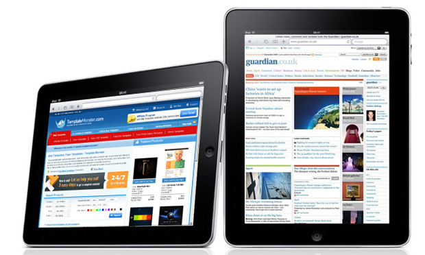
Apple iPad being sold more than 3 million in 80 days, surely gives the room to redefine Web Designing standards. By this time the amount of traffic that your website/blog receives, a little portion of that would be from iPads or iPhones.
So you like it or not, you will have to consider how your website/blog looks on iPad and if necessary redesign it. Well its not a compulsion though but thats the need for future.
Ya, I know you just dont want to start that “Headache” (if that’s what you call it) all over again. So here we are, you want your website/blog to look good on iPads but don’t want to put in all the efforts.
With “ 6 Best Tips On Web Designing For iPad “, I am sure you will need very little effort to do redesigning for iPads.
1. Fluid Layout
Apple iPads have dual mode of viewing : Landscape and Portrait. This means that styling completely changes when orientation changes and for a webdesign er it’s a dilemma “For Which To Design”. It is for this specific reason that the iPad highlights the need for smart fluid width Web Design .
Using a smart combination of CSS and Javascript the User Experience can be made to improve drastically. To learn how to do it, read the tips below.

Landscape and Portrait Views
2. iPad Detection Using Java Script and PHP
One thing is for sure that the CSS that you wrote for “PC” version of your website/blog will not work in iPad. So one solution to this is to redirect your user (if the user comes from iPad or some other mobile) to a different(mobile or iPad compatible) version of your website/blog, which has a Web Design For iPad.
In order to learn how to detect user and how to redirect visit this link http://davidwalsh.name/detect-ipad
3. Adaptive CSS
Well if you don’t want your users to redirect to some other site. A prominent option would be to use multiple CSS styles for different configurations and devices. Another is going for an adaptive content that changes according to the screen resolution.
To learn how to implement adaptive CSS you can visit this link .
4. Link and Hover Effects
It must be remembered that in iPads navigation is done through fingers not mouse. So all those beautiful Hover effects that you have in your website/blog will be of no use, moreover they will prove to be hurdles in navigation in iPad.
Not only hover effects, but even closely packed text links prove to be hurdle in navigation as you would never want your user to dexterously click upon it.
To learn more on Web Design For iPads and Human Interface Guide, Click here .
5. Low Background Contrast
iPads have high light contrast, so black text on white background is more difficult to scan on iPads. You can deploy like a sepia background with a dark umbra font, or a light font on dark background, etc. This will work quite well to reduce sharpness.
The point here is that the Web Design of your website/blog should be such that the contrast is low and it can be easily viewed on iPad.
6. Don’t Use Flash or Java Scripts
iPad Safari browser doesn’t support Flash and Java Scripts. So just don’t use them, you can use CSS instead for the styling purpose (in case you are using Java Scripts for styling).
Do share your opinions with us.


